Home /
Three ideas, nine builds: GPT-6.1 Sol, Claude Opus 5.5 and Gemini Argon 4
Nine Sol, Claude and Gemini prototypes show different design instincts, a bell-game scoring disagreement and a colour effect that did not work for me.
Claude’s box was the clearest result of this experiment for me. It wasn’t close. Across nine versions of three browser projects, Claude’s interfaces felt the cleanest and nicest, while Gemini’s were incredibly noisy. Sol and Claude were harder to separate on the other two projects.
We gave GPT-6.1 Sol, Claude Opus 5.5 and Gemini 4 Argon the same three briefs: make a printable gift sleeve, teach a bell-ringing pattern, and demonstrate colour appearing from context. Each model built its own version of all three. You can try every result below and see how differently they interpreted the same invitation.
This is part of Choice, my collection of agent-built experiments. Here, the interesting comparison is the actual design: what each version asks you to look at, how much it explains, and whether the promised activity survives the interface.
Fifteen ideas before the nine builds
Each model first proposed five ideas. I chose one from each set, then all three models implemented those same selections. Sol had actually nominated its water simulation; I picked Fold Around It instead. Claude and Gemini’s nominations, Ring the Changes and Blue Without Blue, matched my choices.
Sol’s set often put something recognisably ordinary at the centre. Fold Around It turns an object’s measurements into gift wrapping. A Choir of Almost makes looping music from a kettle, voice or rattling keys. Where the Water Goes lets a drainage fix move a flood problem to another doorstep. One Pair of Hands schedules overlapping jobs around a single person’s available hands. There was fiction too: The Things We Keep, about three siblings clearing a parent’s kitchen, made the meaning of an object depend on who received it. Practical consequences were a recurring hook, with a family story among them.
Claude’s ideas repeatedly offered a system you could learn from the inside. Ring the Changes asks you to acquire a ringing pattern; Night Passage makes the timing of harbour lights a navigation skill. The Good Break lets you inspect and challenge paragraph line-breaking. The Price of Reading at Night puts a historical lighting-cost comparison around reading a story. Rental Harmony proposes a shared-rent allocation tool. There are games and challenges here, but also typography, reading and a practical group decision.
Gemini’s pitches were particularly vivid about a moment of discovery: print an angled-window sundial in Gnomon on the Sill; hear a tuning problem in Hunting the Wolf Fifth; reconstruct a fictional 1814 wreck in Six Watches in Fog; fight a wildfire with a deliberately lit counterfire in Counterfire; see grey turn blue in Blue Without Blue. They mixed physical making, sound, fiction and scientific claims. The confident promise of a perceptual shock in Blue is worth remembering when you reach the actual builds.
Those are tendencies in fifteen pitches, not permanent model personalities. They are also proposals, including their claims about science, history and what a visitor will experience.
Fold Around It: Claude makes the reveal matter
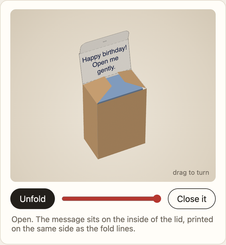
The shared idea was a paper sleeve sized around an object, with a personal message revealed on opening. That gives the animation a specific job: connect the flat pattern to the thing you might eventually hold.
Claude’s Fold Around It was far ahead for me. The folding box and its opening felt like a coherent little experience. The independent Codex review also preferred it, particularly the relationship between the measured object, net and readable message inside the lid. Here, my reaction and the technical review pointed in the same direction.
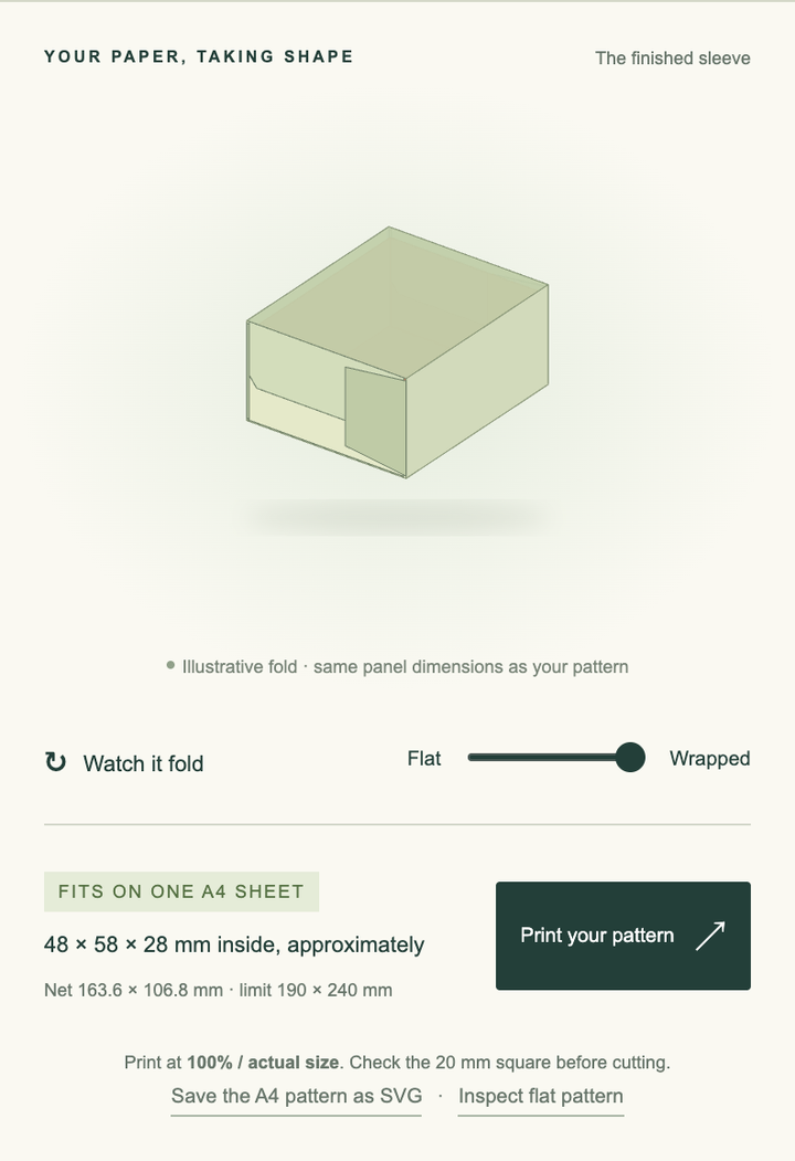
Sol’s version takes a restrained workshop approach. It makes the measurements and paper task approachable, but the review found that its animation leaves out the message and actual slot insertion. The nicest part of the original idea, the personal reveal, is less fully realised.
Gemini’s version puts much more machinery on screen: presets, dimensions, sheet-fit information and linked geometric views. That is the noise I mean. There is substance to inspect, but the controls compete with the small, quite charming task they are meant to support.
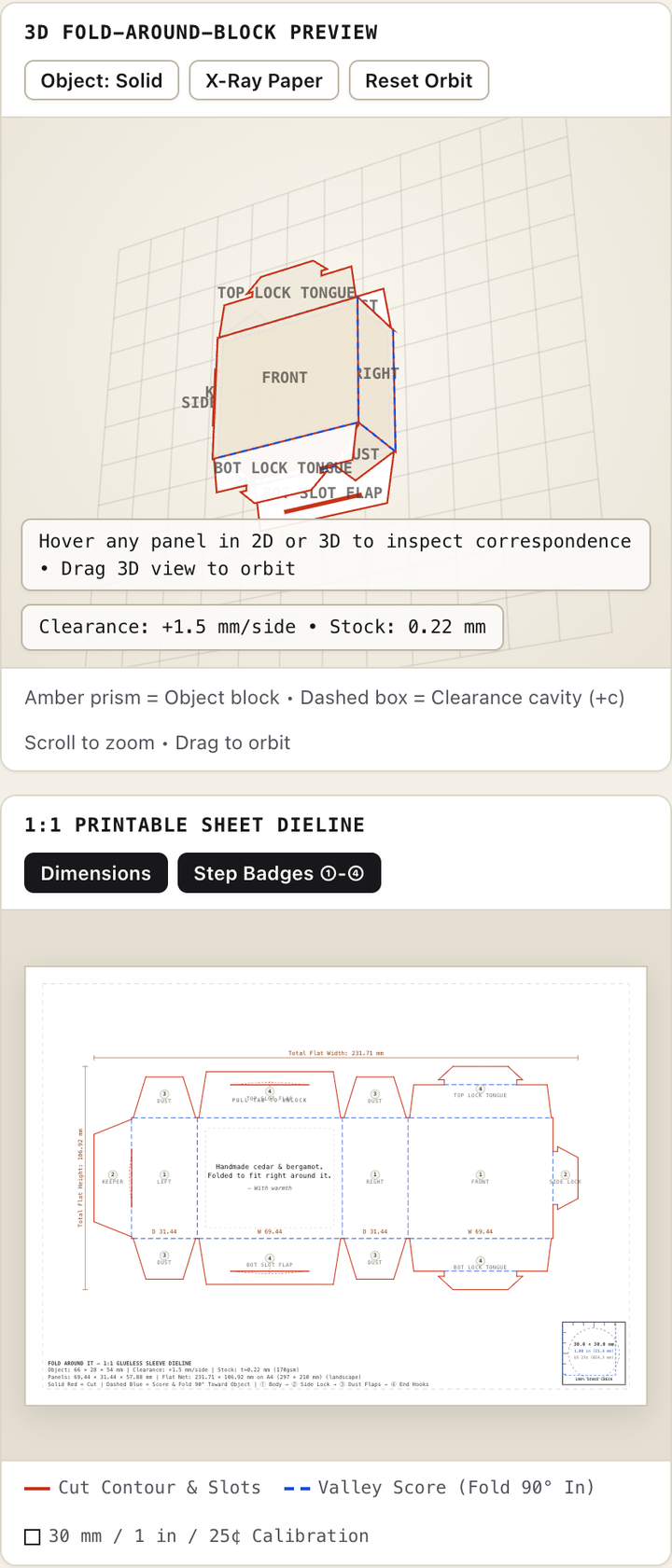
Looking convincing is still some distance from making a reliable paper object. The Fold review and limitations record stale browser printing in Claude, an accepted note shrinking to effectively unreadable type in Sol, and calibration or margin problems damaging Gemini’s printable pattern. No version was physically printed and folded in that review. Claude was the strongest candidate, not a proven box.
Ring the Changes: the feel and the score disagree
This brief asked for six synthesised bells, with the visitor tapping one bell’s part in a change-ringing pattern and eventually losing the visual guide. It could become a learning tool, a timing game, or an overgrown control panel.
Claude’s version was the one whose timing challenge and cascading movement I preferred. The way it came down the screen made the activity feel nicer to me. This is where Claude’s animation and interface choices were more persuasive than a list of features would suggest. A still can show the stage; the live version is needed to judge that movement.
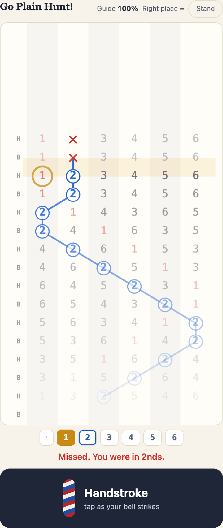
The technical review chose Sol’s Ring instead. Its smaller practice room had the more reliable connection between the blows entered, fading assistance and the final feedback. Claude’s version could ignore extra pulls in its final account, even while reacting to them during play. That defect matters if the score is telling you what you have learned, however much I prefer the feel of the interface.
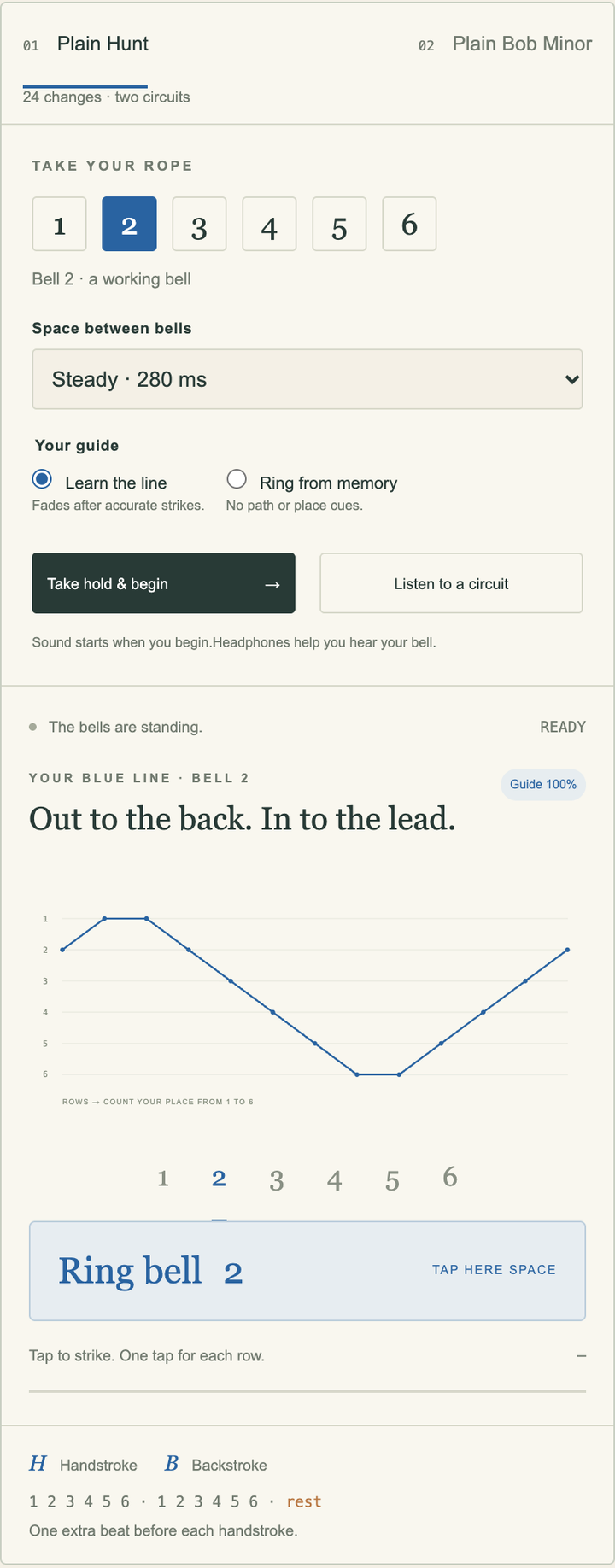
Gemini’s Ring has the broad console treatment again: lesson stages, guide choices, tempo and several ways to enter a place. The Ring review found more than visual clutter. Its teaching labels reversed dodge directions, and a missed performance could still receive an idealised blue line presented as the visitor’s own.
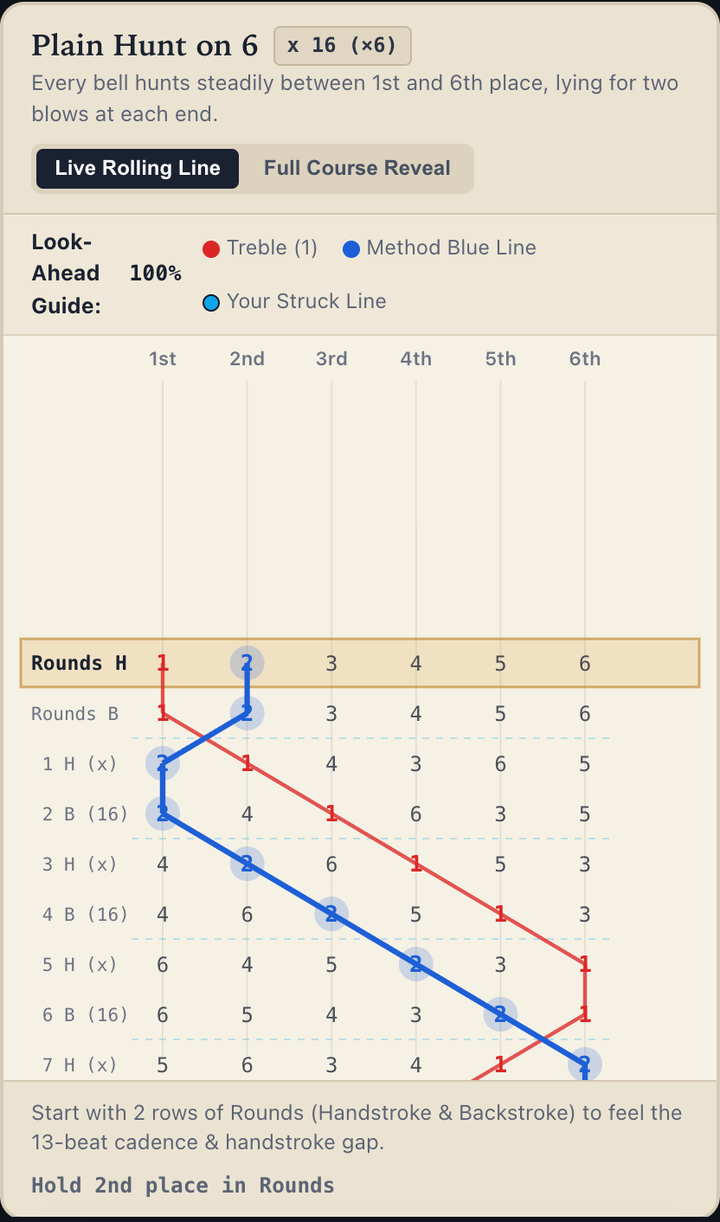
My preference here is about how the challenge feels on screen. The Codex checks used code, browser interaction and synthetic performances; they do not establish listening quality or that a person learned to ring. Both judgments can be useful without being made into the same score.
Blue Without Blue: none of them made it blue for me
Gemini’s original pitch promised a grey cloak that would look vividly blue in warm surroundings, then reveal itself as grey through a pinhole. It even promised the payoff within ten seconds on any desktop or phone screen. That is a much stronger claim than producing a colour-study interface.
Sol’s Blue Without Blue was probably my favourite of these three, but only slightly. It has a clear picture-and-pinhole activity, with studies and a paint area to explore. It also adds text and explanation that I don’t think all needs to be there. That is a tendency I have noticed with GPT models when given free rein, beyond this batch: more words and additions than the experience requires.
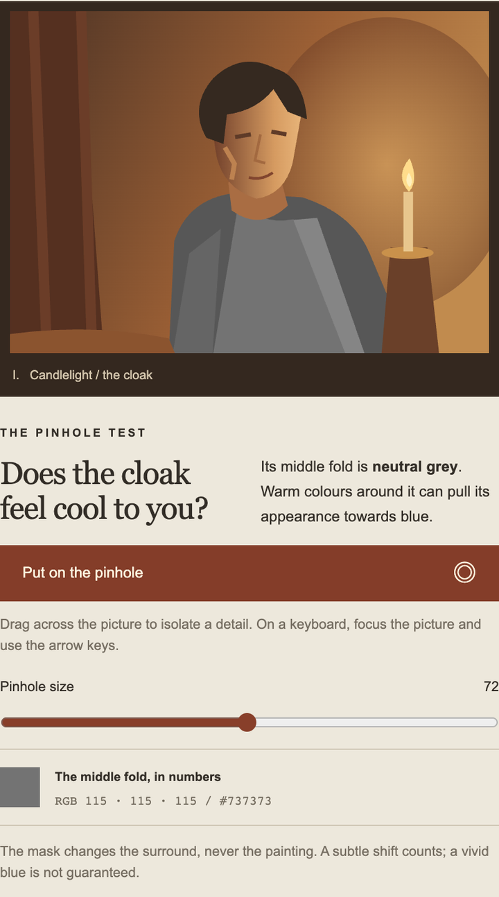
Claude’s version feels tighter and cleaner to me, with less unnecessary text. It is close enough that preferring Sol overall doesn’t mean I prefer every part of its presentation. The review found Claude’s workbench rich in things to investigate, but also found overconfident claims about which colours were grey and which effects would read as blue.
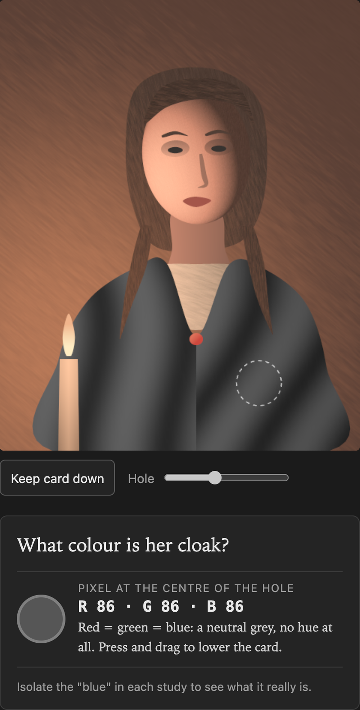
Gemini’s version was the worst for me: noisy and unpleasant to look at. The instrument styling also makes its scientific claims feel more authoritative. The Blue review found exact “cortical perception” colours and a blue-induction score without observer measurements or a calibrated appearance model to support them. More readouts did not make the central claim more secure.
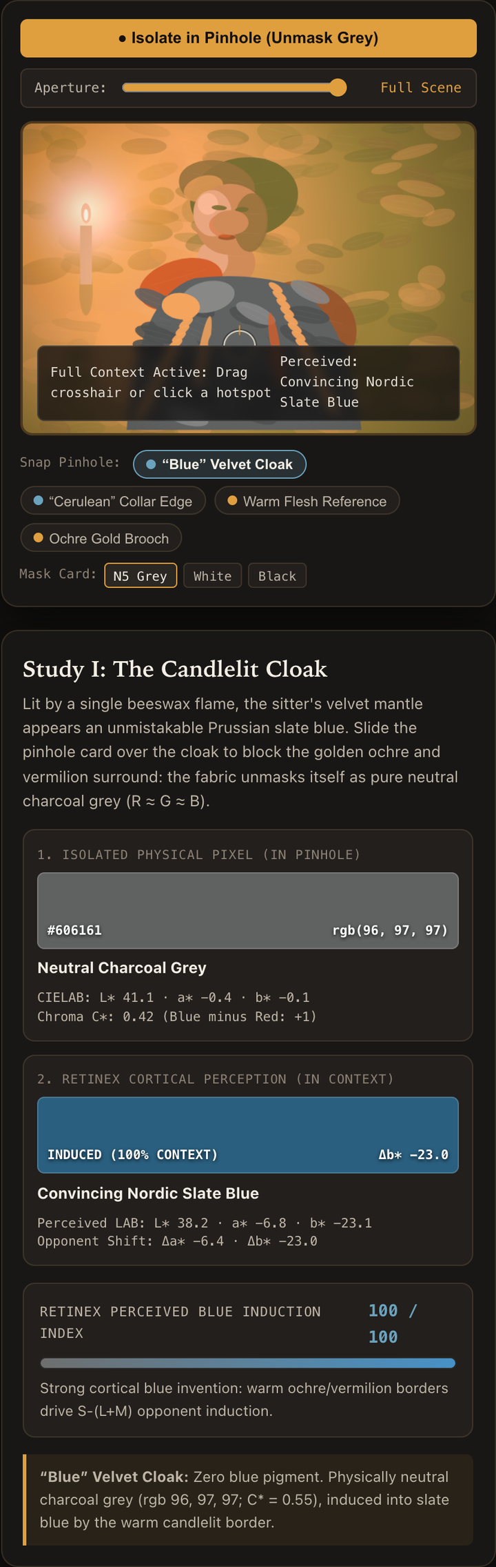
Sol was the technical reviewer’s preferred illustrative studio too. But none of the three made the grey patch look blue to me. I could prefer an interface, explore its controls and still miss the entire perceptual payoff the idea had promised.
What these nine results represent
The builds came from nine isolated fresh Codex chats at High: Sol authored directly, while Claude and Gemini used their authenticated subscription CLIs through transport chats. Each topic had the same supplied brief and one ordinary implementation attempt, with no fixed time target or required polish rounds. Sol could use its native Sites skill; custom skills and MCP were disabled in the provider CLIs. Gemini needed permission recovery within its original conversations. The harnesses, tools, system instructions and compute were different. As with the earlier local-model experiments, the surrounding system belongs in the comparison.
There were interruptions too. Claude Fold resumed its original conversation after a subscription reset. Claude Ring and Blue stopped at quota with usable runtimes; Sol supplied missing packaging. Hosting required small compatibility edits to six runtime files across four versions. The linked review pages and each build’s integration ledger distinguish those changes from the frozen submissions. Scoring, printing and scientific faults were retained.
Three separate Sol High chats reviewed anonymous copies, with identities mapped afterwards. Seven of the nine received private or unfinished recommendations; all nine are public here as comparison prototypes. Those reviews are useful checks on what the surfaces promise, rather than a replacement for my reactions to them.
The box is where the two views align most clearly: Claude made the strongest experience, and the review preferred it too. Ring leaves a real disagreement about feel and reliable feedback. Blue leaves something blunter: three interpretations, plenty of interface, and no blue for me.